8 designs that imagine the future of working from home
Designers share the real pandemic problems that inspired the 2021 Work/Life exhibition

If you're working from home right now, you're one of the lucky ones. Maybe it doesn't always feel that way, though, and if home is a cramped urban space — shared with additional humans and/or pets plus a sprawling assortment of work-related junk — well, there's got to be a better way of doing things. And these designers might have a few solutions.
Going on six years now, Toronto's DesignTO festival has been running a prototype competition called Work/Life, an exhibition featuring fresh ideas that address the peculiar challenges of working from home.
"People are generally living and working in smaller spaces," says Deborah Wang, DesignTO's artistic director, and since 2016, the exhibition has challenged creatives to consider how the boundaries between "quote unquote life and home and work" are blurring.
"Even prior to the pandemic, those were the things that we were thinking about," says Wang. "But this year, it became this almost undesirable thing to be working at home."
As such, Wang calls the latest Work/Life offering "drastically different." True, she says, some of these housewares would have been equally relevant in the Before Times. But when DesignTO put the call out for submissions, they were seeking stuff rooted in our pandemic reality.
There were new questions for the prospective designers to consider: "How has the stay-at-home order changed your life?" Wang says, offering one example. "We thought there was potentially some opportunity for life hacks that could become prototypes, and products eventually. How are these boundaries really shifting for us all?"
A jury will decide the best of the bunch, with the winner taking home $1,000. (A secondary $500 prize is determined by a public vote online.) And as in past years, the competition is presented in partnership with the home accessories brand Umbra, which will be housing the exhibition at its Toronto flagship store, though of course, the space itself is currently closed to visitors. (You can check it out on the DesignTO website Jan. 22 – 31, and a video of the featured designs will play in the store's front window, should you be walking past its John Street location.)
Because of the partnership, there's potential for designers to see their prototypes level up and become Umbra products, though Wang says that's not the competition's M.O., and in fact, only one past winner has made it into stores. (Their Bolo hanging planter was designed by 2017 champ, Simone Ferkul.)
Rather, consider these eight prototypes a vision of how the #WFH lifestyle could be a smidge more comfortable than it is right now.
Peacock Chair by Plural


At the 2020 Work/Life competition, Plural claimed the top prize, and this year's pandemic twist lured the studio back for a second round. Designers Andrew Ferrier, Markus Melcher and Rob Shudra tapped into their own lockdown experience to design the Peacock Chair, an adaptable piece of furniture that comes with its own built-in privacy screen. Shudra says the daily distractions of sharing a space with his partner really kick-started the concept. All the overlapping Zoom meetings and phone calls — "It was just kind of hard to focus," he says, "and I imagine it's something a lot of people are facing at this moment."
Reminiscent of a peacock's fanned-out train of feathers, the chair is fitted with a sheet of stiff felt. (Plural calls this element the "shroud.") Like a convertible cone of silence, a user can rotate this accordion-folded screen up and down as they see fit. It's not 100 per cent noise proof, Shudra says, but when you don't have a private office, a private cocoon could be the next best thing.
Obscura Screen by Ava Nourbaran

A former Toronto resident, Ava Nourbaran currently lives and works out of a one-bedroom apartment in San Francisco, and frankly, she's too busy for distractions, regularly juggling client projects with a teaching job at UC Berkeley.
"For me, the biggest challenge has just been concentration and keeping family and pets and home life at bay," she says. "The Obscura Screen was my literal response to wanting some privacy," she laughs, and it is, essentially, a stylish wooden screen. On one side, she's included a practical addition: a magnetic board for notes and sketches and sundry work-related scraps. A decorative mirror appears on the reverse. And since it's rattan, natural light can still stream through — a particularly valuable feature if you're the one hiding behind it. Use it to carve out some personal space, she says, or consider it a chic alternative to a "do not disturb" sign. Says Nourbaran: "It signals to the other person: Hey! I'm busy!"
The HQ Table by Noda Designs

For another privacy solution, there's the HQ Table from Toronto's Noda Designs. Before tackling the concept, founder Nora Voon conducted an informal poll with a couple dozen of her contacts. "And a lot of our friends, and even clients, told us: 'I don't want to see my partner while I'm working from home,'" she laughs.
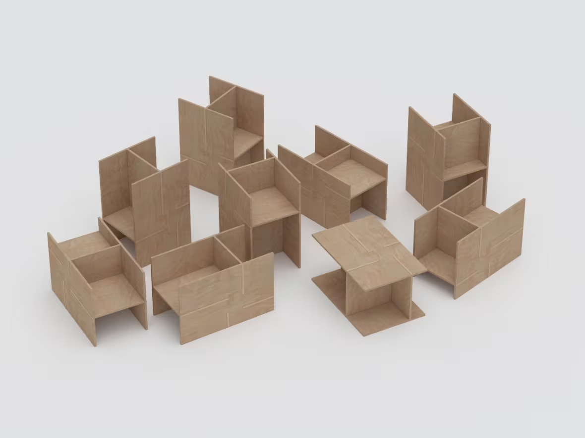
HQ is a multi-purpose table featuring storage (for pens and other small supplies) and, crucially, a convertible partition. That bit pops out, Voon explains. "It's light enough to be lifted out with your finger. You just flip it over and that's it." Designed to be sold in a flat-pack, the table's made of Baltic birch plywood, and construction requires nothing in the way of screws or other hardware. Voon says the pieces click together "like Legos."
"If you have a small space, you don't really have enough room to have both a desk and a dining table," she says, but she imagines it functioning in a variety of environments: office buildings, schools, libraries — anywhere people need to work in peace.
Shuttle by Jeremy Labelle


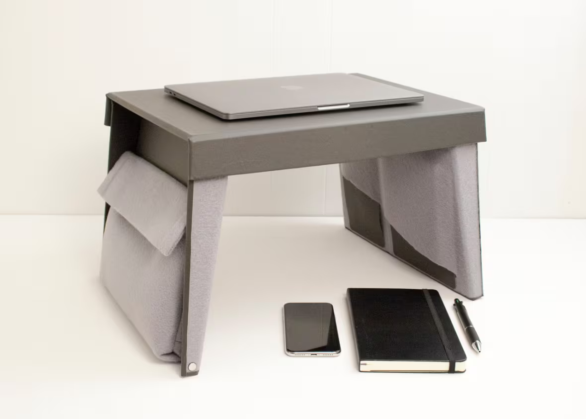
Maybe your home is too small for any table, period. Shuttle can be folded into a 15-inch work surface, suitable for toiling from the couch or the bed or the floor. Set it on a table or counter, though, and it's a standing desk. Or, configure it another way, and use it as a privacy screen.
Everyone's got a different way of using their space, as Jeremy Labelle realized in the early days of lockdown. On video meetings, his remote colleagues would share their life hacks (and ergonomic nightmares). "There were stories of people having to set up their desk on an ironing board and things like that," says Labelle, who's based in Gatineau, Que. But the biggest challenge, as he saw it, wasn't merely finding a place to work. "I don't want to see my work stuff when I'm finished," he says. "So that was the main idea."
Labelle calls Shuttle a "portable office storage solution." Lined with vinyl on one side (for easy wipe down), and felt on the other, it contains pockets for the essentials: phone, notebook, laptop, pens, etc. And when quitting time calls, fold it up like a binder, and it's out of sight, out of mind.
Chair for the Little Prince by Brandon Lim

Brandon Lim's Chair for the Little Prince is another piece that can be approached from multiple angles. Depending on how you stand it, the piece has nine different configurations. It can be the height of a standard dining-room chair, but flip it and it's a bar stool — or something that's not for seating at all, maybe a child-sized desk, or a coffee table.
"My room is quite crowded," says Lim, a recent University of Waterloo graduate. (This prototype, he says, originated as a class project.) And as he sees it, furniture that's designed to have more than one purpose is a space-saving strategy. Less furniture means more room to live and work. And constructed from a single sheet of plywood, Lim actually built the prototype from the confines of home, using the only tool he had around the house: a hand saw.
Tube Bookends by Maha Alavi

How do you make a house feel like a home office? Maha Alavi found the answer in this stainless steel objet. "A lot of people don't have the luxury of having, like, an extra office space," says Alavi, and she speaks from her own experience. She was finishing an industrial design degree when the pandemic hit, and found herself moving back into her parents' place in the GTA.
"I was like, 'OK, how can I make an object that helps somebody get in the work mood?'" she says. Basically, what are the absolute essentials for setting the scene? "I thought of what I would need to start designing something. I wouldn't need a computer right away, but I would need paper, I would need pens, I would need my reference books — and just a sense of overall productivity and peace." Her Tube Bookends double as a storage console for these integral office items.
Much-Room by Superwise

Say it out loud. The name sure sounds like "mushroom." And fittingly enough, these floating shelves are meant to sprout from household furniture, creating some valuable extra workspace.
Superwise founders Cindy Ianniciello and Xavier Laurin live together in Montreal. "It was interesting how we both adapted our workspaces," says Ianniciello, thinking back to the first days of lockdown. "I was at the kitchen table and he was in a really small office in the house." And every available surface was buried in paper, they say. "We were really missing space to put our coffee cups, our phones — whatever objects we needed to have close."
The Much-Room solves that particular issue. The top is made of colourful post-consumer plastic, and the piece is easily installed (and removed), thanks to a clamp at the base. Says Laurin, you could attach it to a table leg, a counter, a shelf — "anything, basically."
Lo Lamp by Notoro

When Notoro's Kenny Nguyen moved apartments last year, one of the first things he needed was a lamp, and this prototype was created especially for his new basement digs. "I describe it as a way to lighten the mood," says the Toronto designer. The frame, made of maple wood, is "a very inviting and warm material." And the concept, he explains, was inspired by traditional Japanese rock gardens. "It's not a bright reading lamp, it's more of a mood lamp," says Nguyen, who personally flicks it on after a long day at work. "This time — it's been rough for a lot of people. I'm talking from personal experience, and the experience of friends and family." And while there's nothing magic about the Lo Lamp — it won't erase all your troubles, he admits — "when you turn it on, it feels very warm."
Work/Life. Jan. 22 – 31. Online and in the front window of the Umbra Concept Store, Toronto. www.designto.org


